SKETCHBOOK NOTES
Building a Realistic Mouth from Simple Shapes
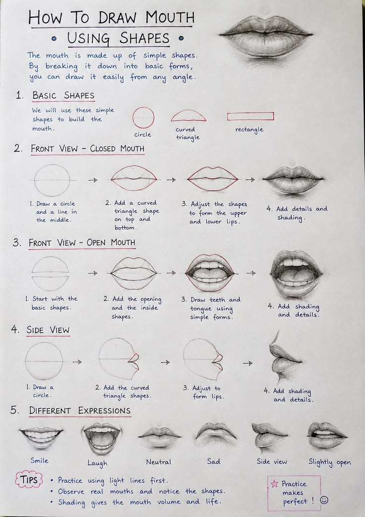
Mouth drawings became much easier for me when I stopped thinking
about lips as two outlines. I now begin with the center line—the
quiet curve where the lips meet—and use it to judge the tilt and
expression. From there I place the widest points of the mouth and
lightly suggest the upper and lower masses. The reference sheet
here is useful because it shows how a complicated feature can grow
from a few simple marks.
The part that usually makes a mouth look believable is not the
outline but the value pattern. The upper lip often turns away from
the light and appears darker, while the lower lip catches softer
highlights. I try to shade across the form instead of tracing a
hard border all the way around it. The corners deserve special
attention too; a small dark accent there can give the mouth depth
without making it look cut out.
When practicing, I like to make several small mouths rather than
spending an hour polishing one. Each attempt teaches something
different about proportion, softness and expression. Keep the
first construction lines faint, compare both sides often, and save
your darkest graphite for the creases that truly need it. A
kneaded eraser is especially handy for lifting the gentle shine on
the lower lip.
SKETCHBOOK NOTES
What People Sketches Taught Me About Gesture and Everyday Poses
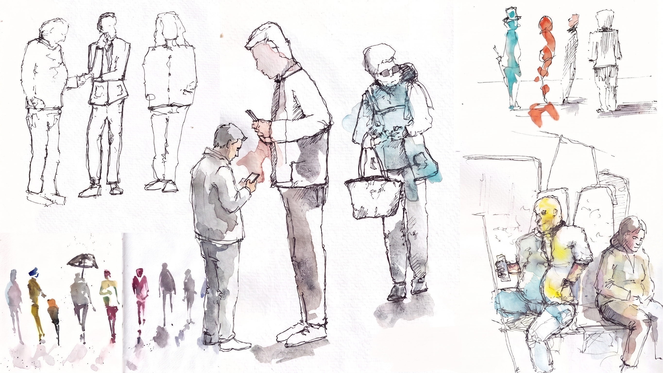
Drawing people in ordinary situations is one of the best ways I
have found to loosen up a stiff sketchbook. A person waiting,
carrying a bag or leaning toward a counter gives you more to study
than anatomy alone. You start noticing balance: where the weight
sits, which shoulder rises, how a bent knee changes the whole
silhouette.
With quick people sketches, I resist the urge to draw the face
first. I look for one long action line through the body, mark the
head as a simple shape, then place the shoulders, hips and feet.
Clothing comes later. This keeps the pose readable even when there
is almost no detail. The figures in this image are a good reminder
that a handful of confident marks can say a lot about age, posture
and movement.
If you want to practice this, give yourself short limits—perhaps
two or five minutes per figure. Do not worry about producing a
finished portrait. Look for the angle of the spine, the spacing
between the feet and the negative shapes around the arms. Some
drawings will be awkward, and that is useful. Over time those
quick observations make longer figure drawings feel much more
natural.
SKETCHBOOK NOTES
A Simple Way to Understand Ear Shapes Before Adding Detail
Ears can look intimidating because there are so many folds packed
into a small area. I used to chase every curve immediately, which
usually produced a busy drawing with the wrong overall shape. A
better approach is to treat the ear first as a tilted outer mass
and only then place the inner structures.
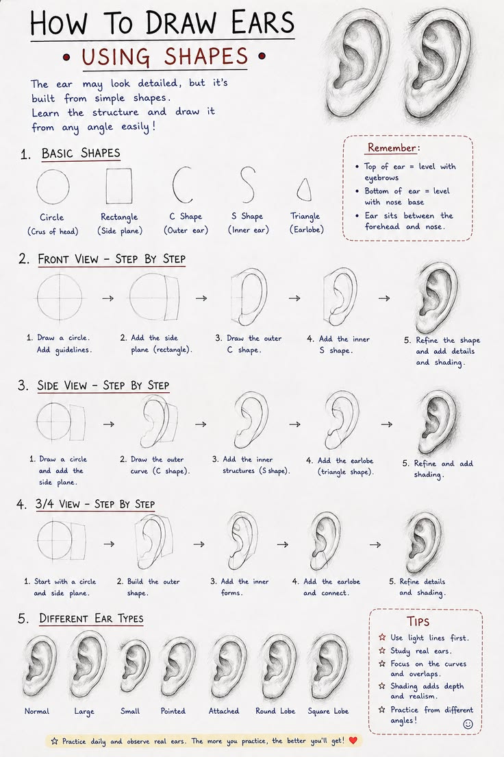
This reference sheet breaks the feature into manageable stages. I
begin by checking the height-to-width relationship and the
direction of the outer rim. Then I place the large inner bowl and
the main Y-shaped cartilage rather than copying every little bump.
Once those landmarks sit correctly, the smaller turns make much
more sense.
Shading is where the ear finally starts to feel three-dimensional.
I keep transitions soft because cartilage is rounded, but I allow
deeper darks where folds overlap or disappear into the ear canal.
On a portrait, remember that the ear should support the face
rather than compete with it. Compare its position with the eyebrow
and nose, and keep edges softer when it sits away from the focal
point. Practicing a row of small ears from different angles is far
more useful than memorizing one perfect symbol.
SKETCHBOOK NOTES
Learning Crowd Sketching One Small Figure at a Time
Crowds used to make me freeze because I saw twenty separate people
that all needed to be drawn correctly. The useful shift was
realizing that a crowd is first a pattern of heights, gaps and
gestures. Individual details can wait.
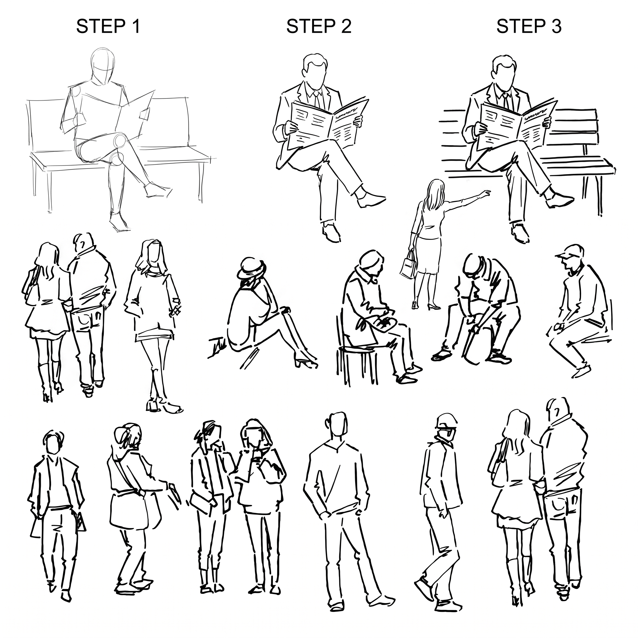
The step-by-step figure studies in this image show a practical way
to build that confidence. Start with tiny bodies made from a head,
a spine direction and a few lines for the limbs. Then group
figures so some overlap. Overlap is important: without it,
everyone looks as if they are standing in a school photograph.
Vary the scale slightly and let some people turn away from the
viewer.
I also pay attention to the empty spaces between figures. Those
negative shapes keep a group from becoming a dark, tangled block.
When I add clothing, I use only enough information to explain the
pose—a jacket edge, a bag strap or the angle of a skirt. For
sketchbook practice, try drawing a small scene from a café,
station or photograph in ten minutes. The goal is not likeness. It
is to capture the rhythm of several people sharing one space.
SKETCHBOOK NOTES
Drawing Cat Fur Without Rendering Every Single Hair
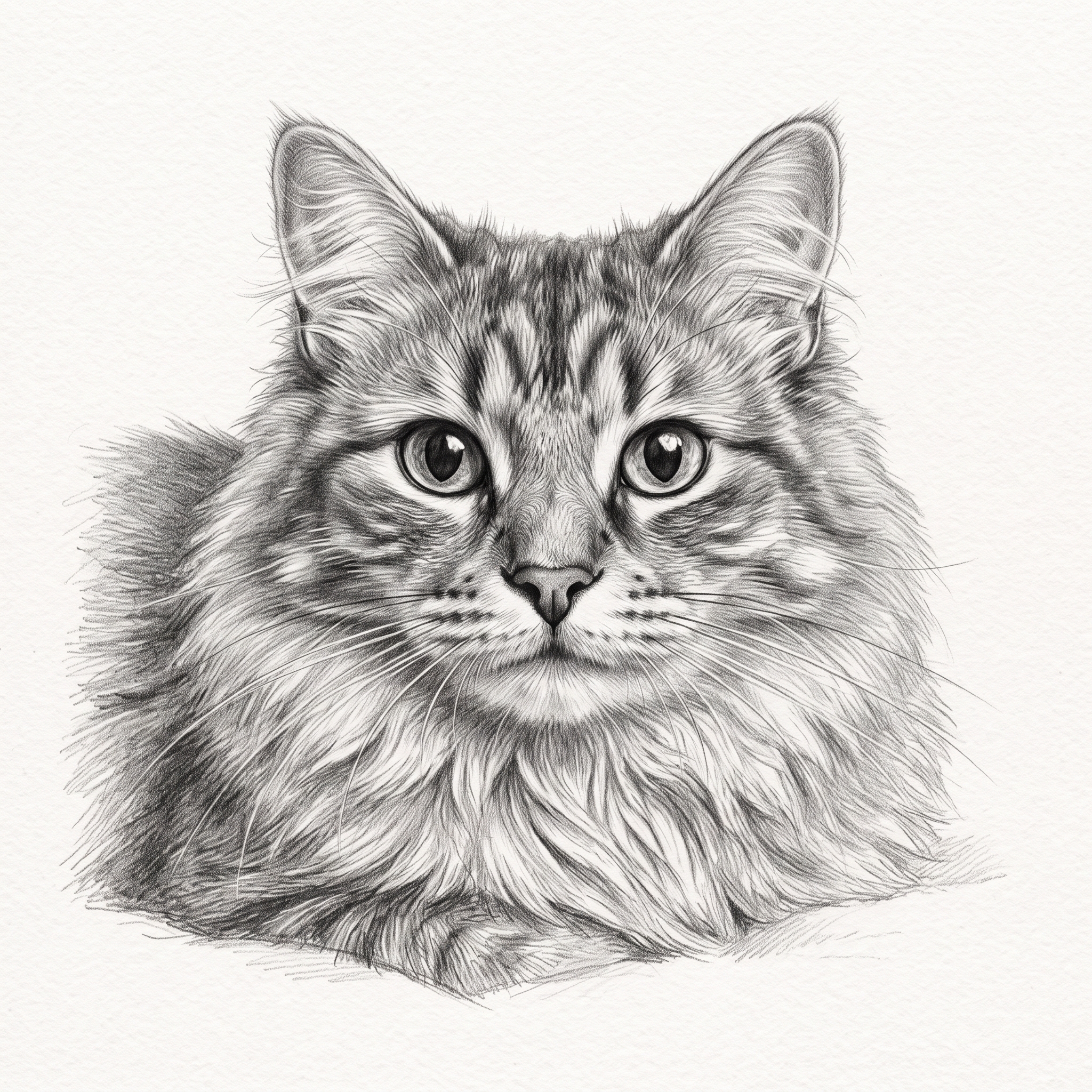
A fluffy cat is a perfect lesson in selective detail. The
temptation is to draw thousands of individual hairs, but that
often flattens the animal and makes the surface noisy. I get a
better result by establishing the head shape, eyes and major
light-and-dark masses before thinking about fur.
In this graphite cat, the direction of the fur helps describe the
form. Hair fans away from the nose, changes direction around the
cheeks and falls differently along the chest. I use broader,
softer graphite for the shadow masses, then place sharper strokes
only in a few areas where the fur catches the light or overlaps an
edge. That contrast between soft and crisp marks creates the
impression of far more detail than is actually drawn.
The eyes need restraint as well. A dark pupil looks strongest when
the surrounding values are controlled and a tiny highlight is
preserved. I often cover the finished eye area with clean paper
while working on the fur so it does not smudge. If you are
practicing animal portraits, spend as much time observing fur
direction and value groups as you do drawing individual strands.
The structure underneath is what makes the coat feel convincing.
SKETCHBOOK NOTES
Why Loose Clothing Studies Help Figure Drawing
Clothing is not decoration added after the body; it is evidence of
the body underneath. That idea changed the way I sketch dressed
figures. Instead of copying every fold, I ask what is pulling the
fabric and where it is hanging freely.
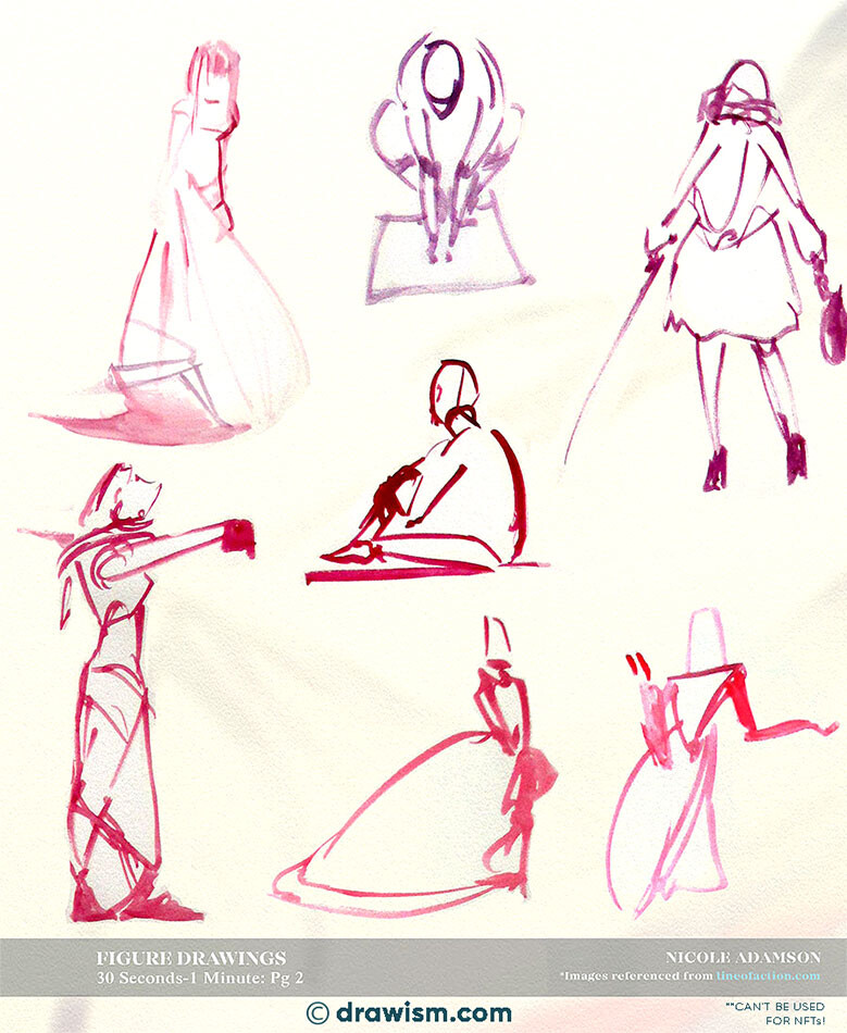
The loose studies in this image are useful because they focus on
silhouette and gesture. A hood, long coat or wide skirt can hide
anatomy, but the weight of the pose is still visible through the
angle of the shoulders, hips and feet. I first draw the person as
a simple gesture, then let the garment hang from key points such
as the shoulders, waist, elbows or knees.
Not every fold deserves a line. I choose the ones that explain
tension, compression or gravity and leave quieter fabric almost
untouched. This makes the sketch clearer and keeps the eye on the
pose. Try using a pen or a single pencil for a page of two-minute
clothing studies. Working quickly prevents over-correction and
encourages you to notice the big shapes first. The result may look
rough, but rough studies often teach more about movement than a
carefully polished outline.
SKETCHBOOK NOTES
Using a Stylized Portrait to Practice Proportion and Expression
Stylized portraits are a surprisingly good place to study
proportion because every choice is visible. Larger eyes,
simplified noses and cleaner shapes do not remove structure; they
ask you to decide which parts of the structure matter most.
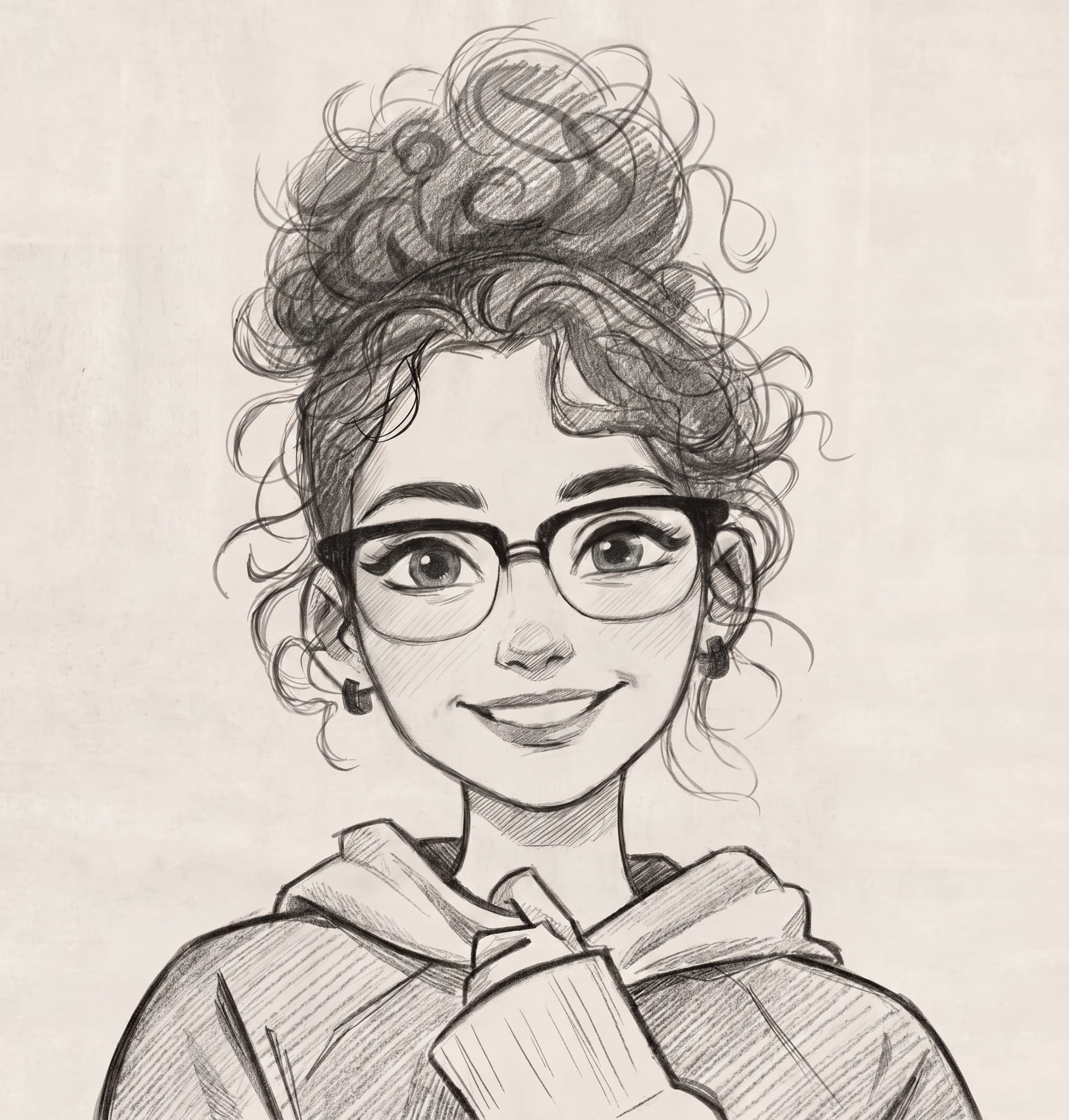
Looking at this character portrait, I would begin with the head
tilt and the placement of the eye line before touching the hair or
glasses. The glasses are especially useful as a measuring device:
they reveal whether the eyes sit at the same angle and whether the
face is balanced. Hair should be treated as a large mass first.
Drawing every curl too early can hide mistakes in the skull shape.
Expression comes from small relationships—the lift of the cheeks,
the curve of the mouth and the amount of eyelid visible around the
eyes. I like to keep these marks light until the face feels right,
then strengthen selected edges. If you usually draw realistic
portraits, an occasional stylized study can make you more aware of
shape design and expression. The aim is not to copy a particular
cartoon formula, but to learn how much personality can be
communicated with fewer, more deliberate marks.
SKETCHBOOK NOTES
From Ear Outline to Form: A Four-Stage Shading Study
One of my favorite ways to practice a difficult feature is to draw
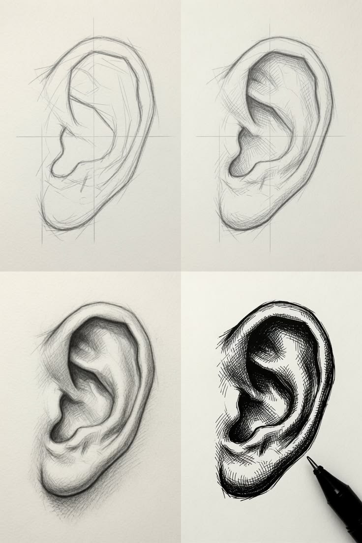
the same subject through several levels of finish. This ear study
does exactly that: simple outline, structural drawing, early value
and a darker final rendering. Seeing the stages side by side makes
it easier to understand what shading is actually doing.
I start with the outer contour but avoid pressing hard. The next
job is to locate the major cartilage shapes and the deep opening
of the ear. At the shading stage, I think in broad value families
first. Which planes face the light? Which folds turn away? Only
after those relationships work do I deepen the narrow occlusion
shadows and add subtle texture.
A common mistake is making every inner line equally dark. Real
ears contain many soft turns, so some boundaries should almost
disappear. Use a sharp pencil for a few precise accents and the
side of the lead for gentle transitions. If the final drawing
becomes muddy, a kneaded eraser can reopen the lighter planes.
Repeating this four-stage exercise from several references is an
efficient way to build both observation and graphite control.
SKETCHBOOK NOTES
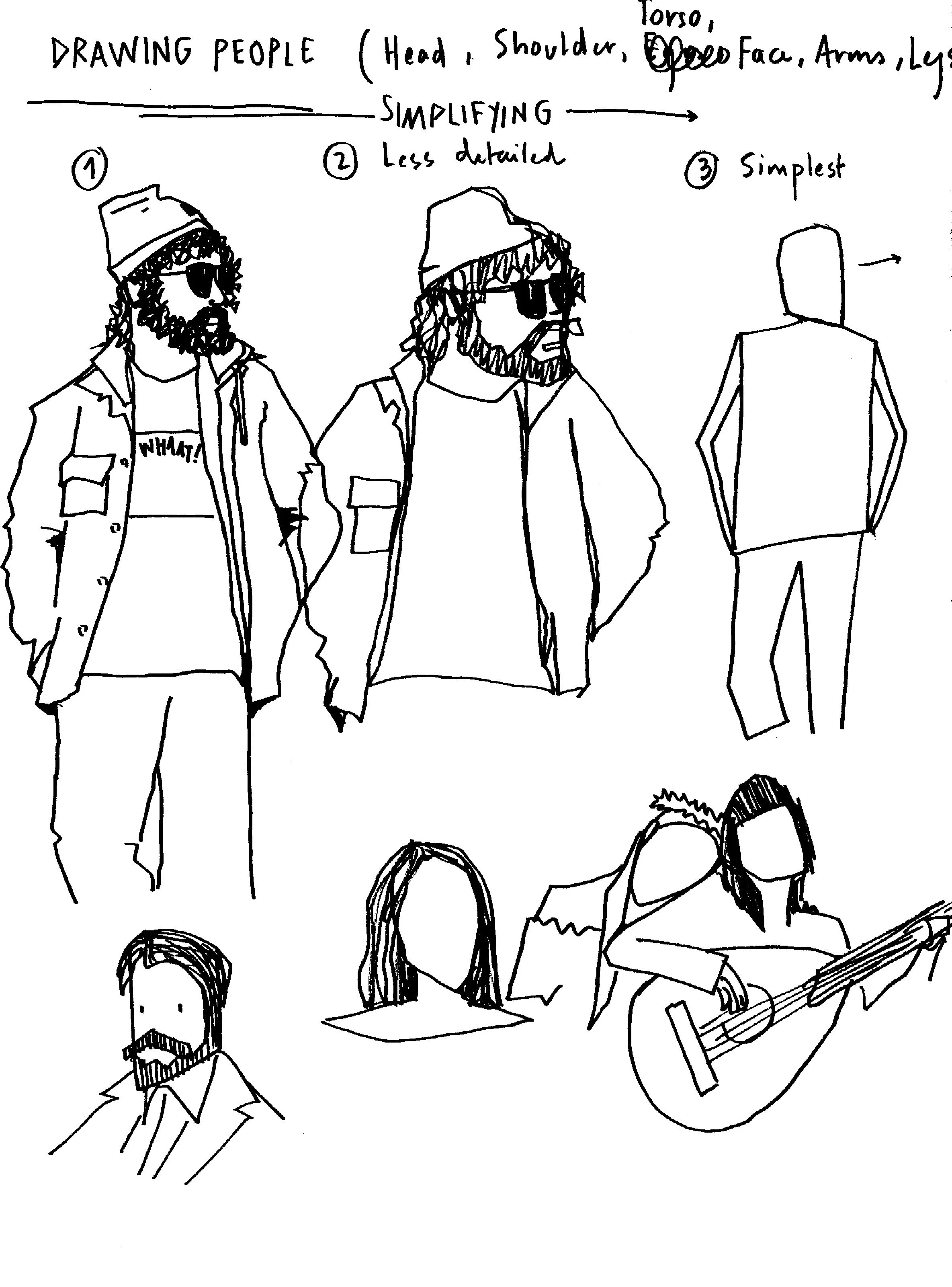
Sketching People in Coats: Finding the Body Under the Fabric
Heavy coats can make a figure look like a rectangle if you copy
the garment without thinking about the person inside it. Before I
draw a coat, I lightly establish the head, shoulder line, hips and
direction of the legs. That invisible framework keeps the pose
alive.
The small studies here show how much information can come from a
few clothing landmarks. A collar tells you where the neck enters
the torso. A sleeve bend reveals the elbow. A hem can show whether
the hips are tilted or whether one leg is stepping forward. Bags
and pockets also help communicate weight and direction, but I add
them only after the main gesture reads clearly.
For shadows, I avoid filling every dark garment with flat
graphite. I leave changes in value so folds remain visible and the
coat still has volume. On lighter clothing, a few darker creases
near compression points may be enough. This kind of study is
excellent for urban sketching because people rarely stay still for
long. Practice capturing the biggest shape in thirty seconds, then
use longer studies when you have time.
SKETCHBOOK NOTES
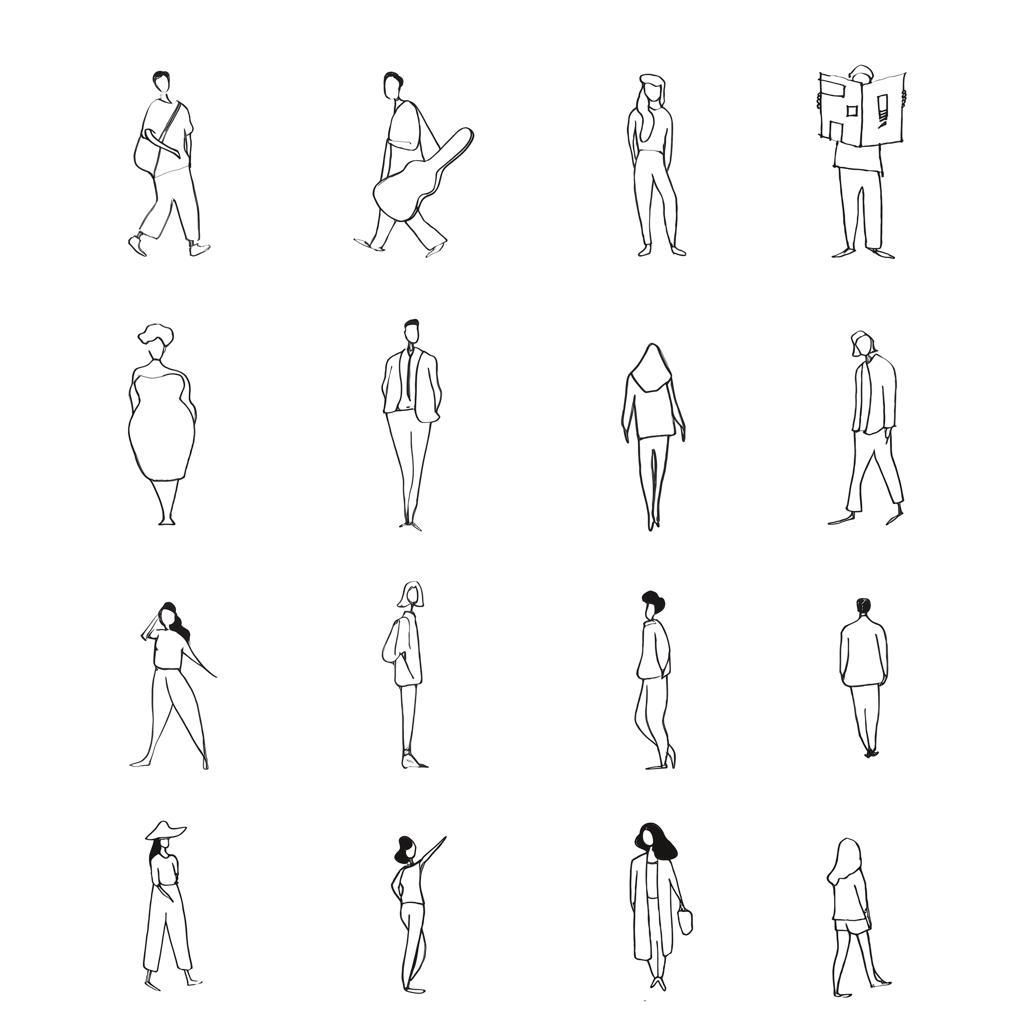
Tiny Figure Studies for Better Proportion and Silhouette
Small figure drawings remove the possibility of hiding behind
detail. When a person is only a few centimeters tall, the pose
either reads or it does not. That makes tiny studies excellent
training for proportion and silhouette.
I usually begin with the head and a single directional line
through the torso. Then I place the feet early. Knowing where the
figure meets the ground helps me judge the length of the legs and
the overall balance. Arms are added as simple angles, and clothing
is reduced to the shapes that change the silhouette.
The figures in this reference demonstrate how different poses can
remain recognizable with very little information. Notice the
spacing between the legs, the tilt of the shoulders and how a bag
or coat changes the outer contour. Try filling one page with ten
or fifteen figures and avoid erasing. Some will fail, but the
repetition trains your eye to compare lengths quickly. Later, when
you return to a larger portrait or full-body drawing, those
proportion decisions become faster and more confident.
SKETCHBOOK NOTES
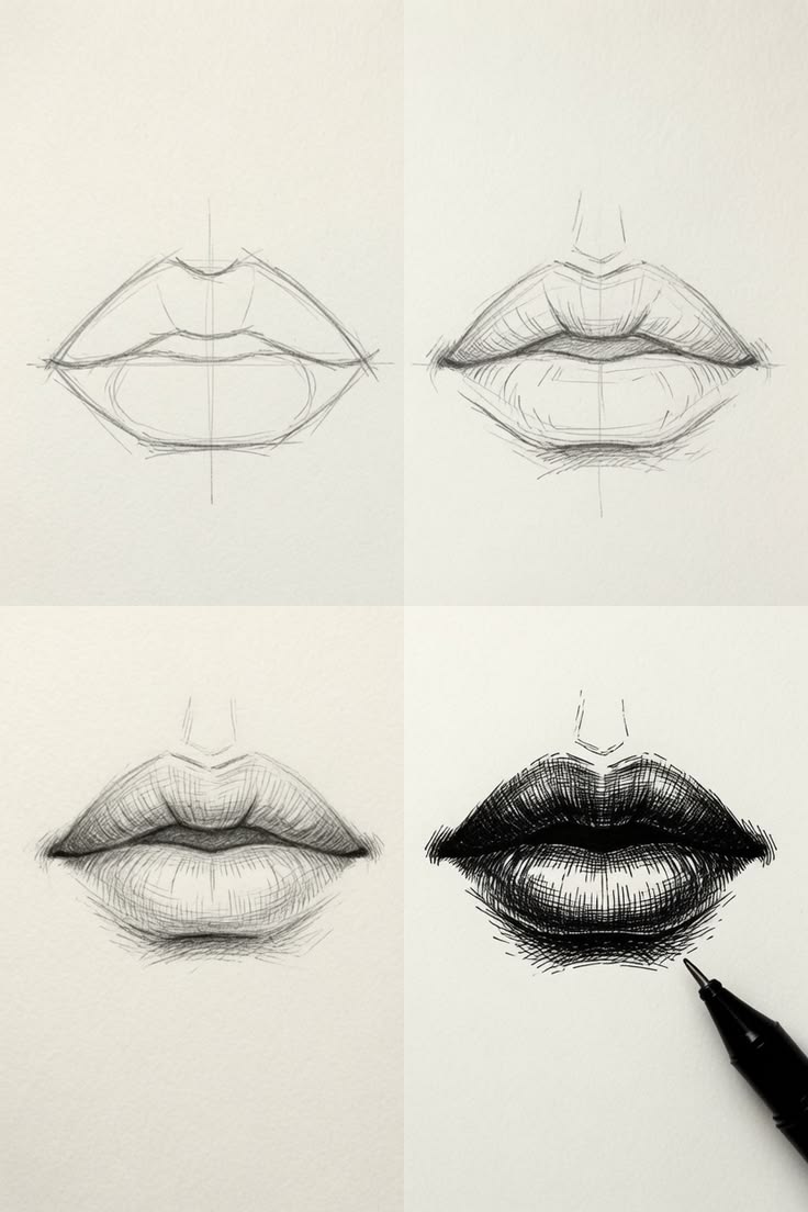
How I Build Realistic Lips with Value Instead of Heavy Outlines
Realistic lips rarely need a dark line around their entire edge.
In fact, removing that outline is often the moment a lip study
starts to look more natural. I first map the center seam and the
broad shape, then let light and shadow describe most of the
boundary.
This progression from simple construction to a finished dark lip
is a useful reminder to work in stages. The upper lip can often
take a deeper value because of its angle, while the lower lip has
broader, softer light. The darkest marks usually belong at the
mouth opening, corners and a few small creases—not everywhere.
I blend sparingly. Too much rubbing can make lips look plastic, so
I prefer building graphite in thin layers and using a kneaded
eraser to lift highlights. Vertical texture lines should follow
the roundness of the lips and vary in strength. Before finishing,
I squint at the reference and drawing together. If the big value
pattern matches, the feature will usually feel convincing even
without dozens of tiny details.
SKETCHBOOK NOTES
Drawing a Finger in Graphite: Structure Before Skin Texture
Fingers are easy to overcomplicate because we notice nails,
wrinkles and skin texture immediately. I have better results when
I ignore all of that at first and treat the finger as a set of
simple rounded forms. The direction of the center axis and the
taper toward the fingertip matter more than any crease.
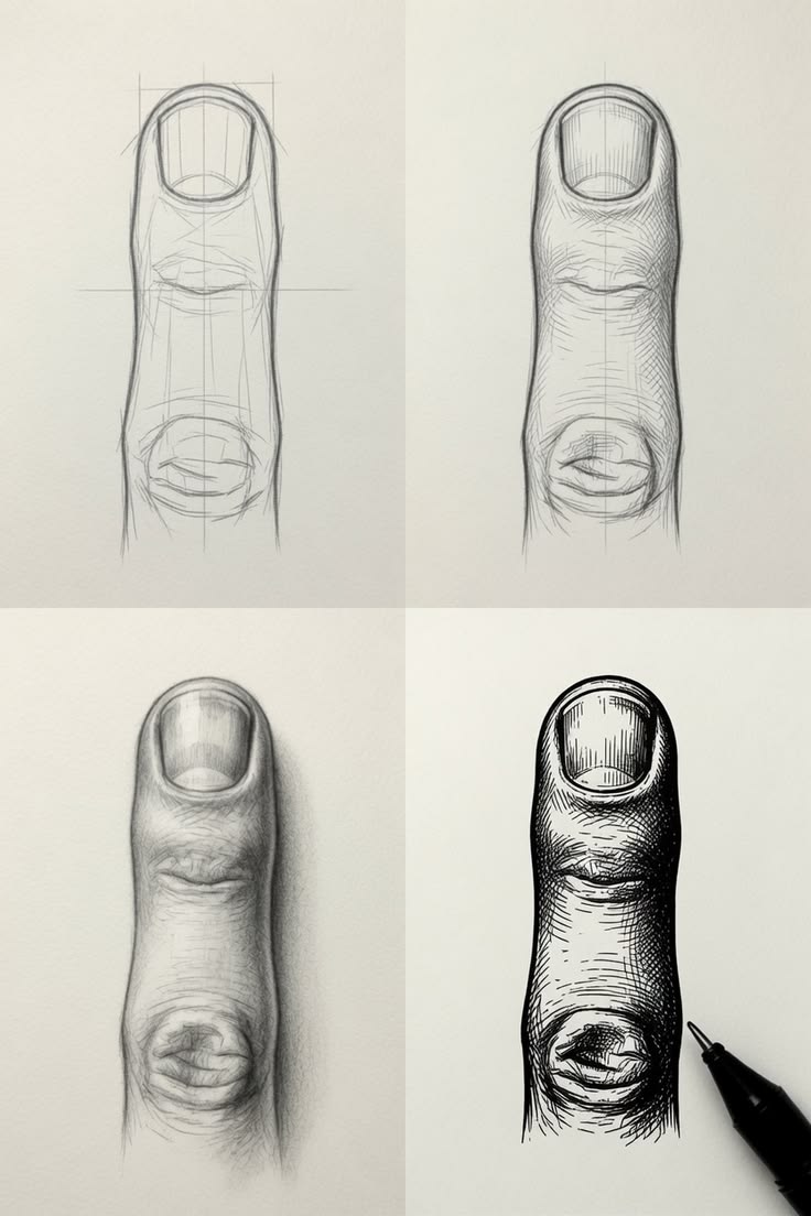
The stages in this image show how a plain construction can become
a dimensional graphite study. I place the nail as a thin plane
wrapping around the top of the finger rather than as a sticker
sitting on it. Then I establish the shadow side with broad, light
layers. Darker accents around the nail edge and joint creases are
added only after the form reads correctly.
Skin texture should be subtle. A few broken lines and lifted
highlights can suggest it without covering the entire surface. Pay
attention to edge softness too: the lit side may blend gently into
the background while a shadow edge can be firmer. If hands are
difficult for you, practicing one finger at a time is a useful
bridge between basic forms and a complete hand drawing.